Thursday 26 April 2012

Technology- Imovie

For post production we used i movie to edit our film. there where a few problems using this software to edit with, firstly there was only one film track so limited our ability to layer clips over each other, we needed to do this to key out a green screen and layer a dead body over the top, we also needed to accurately re-size the dead body, we encountered a problem that the film wouldn't accurately re-size we had to use shrink this was not accurate and ended cutting out part of the scene.  

The last scene we did was the titles the original shot was just a green screen but we put in lots of different images to make the titles we where able to make a still image from the clip and then used that, no one would notice that it was a still as their attention would be in the center of the moving images.

The soundtrack was easy to manipulate and change the volume and fade in and out point to allow for unnoticeable transition between sound.


BBFC research

The BBFC tend to only give 15 and 18 ratings for horror films.


The 15 rating for films says that "No one younger than 15 may see a ‘15’ film in a cinema. No one younger than 15 may rent or buy a ‘15’ rated video work" To classify a film as a 15 in terms of a horror film it say "Strong threat and menace are permitted unless sadistic or sexualized" this is because strong threats can be particularly scary and would not be suitable for a 12 or 12A. The BBFC also classify films on ways that it could be imitated, they state that "Dangerous behaviour (for example, hanging, suicide and self-harming) should not dwell on detail which could be copied. Easily accessible weapons should not be glamorized" This is showing that people aged 15 and above (in theory) have reached a level of maturity that 12 year old don't have. The BBFC also take into account the amount of violence in the film while classifying it, the classification states "Violence may be strong but should not dwell on the infliction of pain or injury. The strongest gory images are unlikely to be acceptable" The strong gory images wont be accepted as not everyone wants to see gore and still can frighten 15 year olds.


Our film was classed as a 15 as we  believed that if the film was allowed to  continue the threat would become very menacing and frightening, we didn't use any weapons and showed no gore, there is one scene where a girl screams, this is not in pain so we didn't dwell on the factor of pain. We used alcohol in one scene we found that this falls under the DRUGS section of the BBFC, The classification stated "Drug taking may be shown but the film as a whole must not promote or encourage drug misuse" our film didn't promote or encourage the use of alcohol but we used it to generate a stereotype of teenagers.
Overall our film fitted in to most of the 15 classification,  the Film was not meeting the 18 classification but too much for a 12 or 12A classification.


The 18 classification is the same as the 15 rating but mainly concentrates on Sex, criminal activity and actual harm to people or public health. A 18 film isn't clear on horror unless it is "sadistic or sexualized"as this is not allowed at  15 classification. Also gory images that are not allowed at 15 would be allowed at 18. An 18 classified film wouldn't allow for any illegal actions to be shown in the film if they where actually committed and not acted.


Our film was not an 18 as it involved no "gory" scenes but had slight bit of gore for our production logo, there was no sex in the film or any actual criminal activity  so our film was not classed as an 18.  


Prezi Tutorial


This Video helped me allot because i wasn't really familiar with Prezi. This video helped me because it shown me the basics on how to use the website and how to add text,images,video and frames. This video was very useful and its quick and simple so i recommend anyone new to Prezi to watch this first because it would help allot!

Q7 Filmed Evaluation


Wednesday 25 April 2012

Sam Russo Prezi Presentation Question 6

Evaluation Question 4

The audience for our media product would be males aged 18-29 according to our IMDB research http://bilborough619.blogspot.co.uk/2011/12/sam-russo-demographic-for-phycological.html

We rated our film a 15 because the characters are drinking alcohol and that there is a threat that is killing general people. Here is a link to my BBFC research which shows you that most phycological horrors are rated a 15: http://bilborough619.blogspot.co.uk/2012/04/bbfc-research.html

We wanted to attract the audiences aged 18-29 because people this age watch phycological horror. We thought by adding alcohol it would attract the audiences attention especially because they are aged 18-29 and they are in there university years and would be drinking alcohol regularly so by having this they could compare them to themselves. 

We also thought by having 2 young women as our main characters it would attract the the attention of young adults especially that the people who would see this film are aged 18-29. People would also be interested to see what will happen to the 2 female characters since they are both vulnerable and they are also drinking with makes them even more vulnerable and it would make them want to see what will happen next.

The soundtrack used at the start of the film engages the audience and puts them in the party spirit since the song is cheerful and loud. Then since the soundtrack suddenly changes into a dark spooky sound which straight away captures the audiences attention since they would be waiting for something scary to happen.

Overall i believe we have successfully apealed to our target audience and we have tried to create a realistic phycological genre. Despite the fact 18-29 is our main audience we would like to appeal to a larger target audience because more interest in our film would make it more successful.


Clip designed to reach my target audience

This picture is designed to reach the audiences attention. Since the main characters are two young women this will instantly grab young mens attention and it would make them want the to watch the film even more. In our IMDB research we saw that most people who watch a phycological horror are males aged 18-29 so by putting 2 females it would grab the males attention even more. Plus the way the two girls are acting in this picture drinking and going out for a party people watching this would feel more engaged since the majority of the males watching this are aged 18-29 and would probably be doing the same thing so this blends in with there life and grabs there attention. We have tried to represent the convention of female victims in horror since this is what our audience would be expecting and that the two girls are vulnerable.

Compare and contrast your production company logo with a competitor


There are many LIONS GATE logos out there all of them starting the same but then changing at the very end this how the logo is presented : 


LIONS GATE'S logo will always give you a hint on what the film is for example if the logo is red it would mean that it would be a horror film if the logo is very light colours like the video above it would be more of a calm movie.

This is the production company logo that we have made '666 Productions'

You can see straight away that this logo is not the same looking as the LIONS GATE logo but just by seeing this logo you would already know that this film would be a horror because this logo has dark red writing with a bloody background. You can relate this poster to the Red LIONS GATE logo since they both tell you that the film your about to watch is a horror.

Construction and Feedback


In many horror films out there they use female characters as victims this is because they are portrayed as weaker than males. When looking at social groups we can see that the ages of characters provide different representation. For example, teenagers are seen as trouble makers and are often associated with drink and drugs. Because of this we have chosen for our characters to be drinking and to be going out for a party as this fits conventions of social groups.


This picture is from the film 'Cabin In The Woods' In this picture you can also see a group of young adults having a party drinking alcohol. We have copied this representation of teenagers by using 2 females within the similar age groups and copying the stereotypes of this age by having them drink alcohol. We have used similar social representation

Analyse the representation in existing films from your sub-genre

Q1.This is a scene from the film 'Silent Hill' In this scene gender is represented by the characters being female. Having female characters in a horror will make it look more scary and more intresting for the audience to watch because there not very strong and they are inferior to the creatures trying to kill them. Also since the victim was a female it already gives you the idea that the females were not fit enough to escape and so one of them got caught and killed at you can see from the clip. Age is also represented by showing one of the women being very old and weak and a bit crazy this would be a sterio type in cases since people often decribe older people as 'crazy' and 'very weak'.


This clip is from the film 'The Shining' In this scene gender is represented by the jack trying to kill his wife wendy and by wendy fighting for her life and crying. This scene shows the jack trying to kill his wife wendy by trying to axe the door down this represents gender because hes a man and they show him as a strong person showing that he is more powerful to women and that he is in charge and he wont have nothing stopping him. This scene also shows wendy trying to fight for her life this represents gender because she is a female and she is much weaker that her husband jack. This scene shows that she is inferior than him and she hasnt got enough strengh to stop him so you see her crying showing that she knows that she is going to get killed and she wont be able to stop him.

How planning helped me understand social groups representation


First of all the two characters used in this film are girls where straght away sets the mood of the film because the person watching the film will automataclly be more engaged becuase he sees two vulnerable and weak girls ready to go out for a party. By using 2 girls males would be more intrested into watching the film plus by the two girls drinking alcohol it makes them even more vulnerable and this straght away gives us the hint that something is going to happen to them and they wont be able to protect themself. The story relates to the phycological sub-genre because you don't know what or who the threat is and why this threat is killing people in the general public.

BBFC Research

This is the film poster for Silent hill. BBFC rated this movie a 15 they say "it contains bloody horror and strang language" I agree on this because this movie is very violent especilly on the scene when one of the creatures rips all of this womans skin off. That scene is very bloody.


This is the film poster for Paranormal Activity 3 BBFC rated this film a 15. BBFC say "The use of strong language (for example, 'fuck') must be infrequent'. This film contains about ten uses of strong language and is therefore more appropriately placed at 15" This film also Contains threat, infrequent sex references & violence. I agree with this because you cant see the threat and this film is very violent especially the scene when the threat is dragging the baby by its feet.


This is the film poster for The Thing. BBFC rated this film a 18. BBFC says "The shape-shifting nature of the alien in the film is depicted through shots of bleeding heads, an alien head exploding out of a stomach" &"The film includes scenes of strong violence and gory horror" This film also contains Strong language and should deffenitly be rated an 18.
By looking at these films i agree that our film should was rated correctly and should stay a 15 since the majority of phycological horrors these days are 15 and also there is no strong language.

Advertisement Campaign

The places and websites my poster and trailer will appear are on Most viewed websites such as Youtube. On youtube people will see the trailer and they would tell other people about it therefor the word would spread around. My poster will also appear on facebook and Twitter since being a social networking people will see it and would want to go see it. The Trailer would come out a couple of weeks before the film actually releases since being an indepentend film company we havnt got enough money to let the trailer play for a long period of time. The film that will procced ofter our trailer is played would be big hollywood blockbusters such as Cabin In The Woods also being a horror and Prometheus again another horror.
Audience and ratings


Silent hill -  silent hill has been given a 15 rating by the BBFC this is probably because of the horror shown and pain inflicted by burning alive, but the BBFC say "Violence may be strong but should not dwell on the infliction of pain or injury" According to IMDB the average user rating of this film is 6.5 from 90,519 users.


http://www.youtube.com/watch?v=f5mT5LhbRJw


The shining- The shining has a 15 rating from the BBFC this is due to the fact that there is no real gore apart from the two dead girls and blood running from the lift, there is also a scene where a mans suicide is described the BBFC say "Dangerous behaviour (for example, hanging, suicide and self-harming) should not dwell on detail which could be copied" According to IMDB the average user rating for this film is  8.5 from 261,750 users.


http://www.youtube.com/watch?v=3b726feAhdU


Dark water - Dark water  has been given a 15 rating this is because of the dark nature off the film and also the ending to the film has some confusion to wether or not the lead actress commits suicide the BBFC say "Dangerous behaviour (for example, hanging, suicide and self-harming) should not dwell on detail which could be copied" The average user rating from IMDB is 5.6 from 26,971 users

http://www.youtube.com/watch?v=t24DuU9TXRM


The eye -  The eye was given a 15 rateing by the BBFC this is probably due to the fact that the film shows sceens of suicide and dwells on the infliction of pain and injury, there are also gorey sections that are not allowed by 12 or 12A certificetes. The eye go a  5.2  rateing from 24,482 users on IMDB.


 http://www.youtube.com/watch?v=SOxzXVGaEY8


The rite - The rite was given a 15 rating by the BBFC i belive this to be because of disturbing and gorey imagery that isnt shown in the trailor but i belive is shown in the film. the BBFC say "Strong threat and menace are permitted unless sadistic or sexualised" the  film shows a strong threat. On IMDB the rite got 5.9 from 37,801 users.


http://www.youtube.com/watch?v=FhHnP-9iekg

Monday 23 April 2012

Movie Poster for Static

This is the poster i made for our film 'Static' To make this poster i used Photoshop i made the poster all black to give it the effect it was at night and also i think having the static in the middle of the poster gives it a scary effect. I also thought if i added a scary frase in the poster 'You're Next' the audience would be more intrested into watch it. When people see the colour black the first thing people would think of is darkness and the unknown therfore this would atrract the audience even more to want to go this film.

Evaluation Q1

This is the logo of our film opening logo. This title develops horror conventions since its in red and black with a scary effect and with blood on the backgroud defiantly sowing that the films going to be a horror. You can compare this image with the image beneath (Twisted Pictures) by showing that they both give the effect of the film being a horror.


TwistedPicturesSawLogo2Sm.gif


This Picture inspires me because its simple but then it gets a scary affect with the barbed wire and changes it completely. This picture is developing horror conventions since it has a barbed wire going through the letters which gives it a scary effect. 


This is the Title of our film. This title is developing horror conventions since the whole image is quite dark and confusing since the audience wouldn't know what it would be about all they would see is a dark tv screen with scary shades and the word "Static" in a scary sketchy way this this shows that who ever would see this would definitely think this is a horror film. This can be compared to the image below (SILENT HILL) since they both come under the horror genre and there both have a scary affect which will attract the audience to go and see the film.


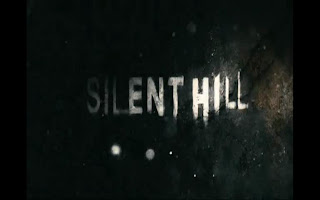
This is the title form the film "Silent Hill" This picture inspired me because the the words of this picture are all different and the font is quite scary what tops it off it that the background makes it look like its a old rusty which gives a hint of the location of the film and what it would be about. This is developing horror conventions since its visually scary and every single piece of the picture makes it look like a horror and would definitely attract the audience to go and see this horror.


This is a picture of our film we made. This picture is developing horror conventions since it has a dead person on frame this obviously tells you that the genre of this film is a horror . This can be compared with the image below(silent hill) by both of these images having a dead body in frame and both telling the audience that this is a horror film.


This is a picture is from the film "silent hill" This picture inspired me because it shows a dead body hanged up onto a fence in a pitch black room with many flesh wounds and i knew it would attract allot of audiences . This is visually scary just by looking at it. This picture is developing horror conventions since there is a dead body on the screen which gives the viewers a shocking affect.


This is a image of our film "static" showing the established characters. As we can see here there are 2 girls which are young and also being female there vulnerable This image comes under developing horror conversions since the 2 girls are vulnerable. This can be compared to the picture below (silent hill) because both pictures use two vulnerable girls.


This is a picture from the film"silent hill" this picture shows 2 girls looking scared once again vulnerable and gives he effect that someone is there trying t kill them also what they are wearing and the props used  look like they are defending themselfs from something scary. This comes under developing horror conventions since they both female and they look vulnerable.


This is a picture from our film 'Static' this picture establishes mise-en-scene.this picture also challenges the convention of my sub genere since it leads to the girls getting killed at the end and by looking at this picture you can see that the girls are drinking so the audience would asume that there going out for a party. 


This is a picture of the film 'silent hill' in this picture you can see the prop used at the start of the film. This picture establishes mise-en-scene.
This picture develops the conventions of horror because the sign used is old and spooky and as soon as you would see it you would know that the film is a horror


  1. These 4 pictures are key images of the film we recorded called 'Staic' the top 2 images challenge the conventions of horror while the bottom 2 develops it.the top 2 challenge it becuse it leads to the killing and there getting ready to go out to a party and you yet wont expect the film being a horror. The bottom to develop conventions of horror by showing people dead these are the victims of the killer inside the tv anyone who will see this will know that this film i a horror.


These are the key imges from the film 'silent hill' these 4 pictures are developing horror conventions since you see people getting killed and weird creatures. By looking at these pictures you can clearly tell that this is a horror film.

Wednesday 18 April 2012

A clip designed to reach my target audience


Our target audience are males aged 18- 29, even though the film is a 15 our IMDB reaserch said that the audience that watched phycolgical horrors where males aged 18- 29. So we made the opening look attractive to this audience we did this firstly by useing teenage girls because men are pulled in with haveing women actors. Secondly we added in the drinking alcohol because a large amount of men aged 18- 29 are at univesity living the "student life" which involves lots of drinking, we belived showing them this would give it a sence of normality.

Filmed evaluation of STATIC

Advertisement campaign

The poster that i made i belive should be shown online on sites such as facebook to viraly market it, the poster cant be shown outside in public because of the blood as people or children may see this and feel sick or scared. I would like the trailer should be released before the big summer block busters for example The Avengers  or a horror like cabbin in the woods, the second of the two would be more aceptable because it is a horror. Because we are a small company i belive that we should have the trailer before films at film festivles or before a "indie" film at a cinima.

engageing my audience

We wanted to engage our target audience primeraly but we didnt want it to be exclusive to them as we didnt want to lose posible audience. We targeted males with the appel of having women actors as the only cast in the opening sequence, this was easy to do and easy to do if we wanted to target females by switching the women for men. We also wanted to attract a target audience aged 18- 24 as we know this age group are of university age and most of them want the "student life" so we involved alcohol in the begining of the sequence.

The music we used at the begining was made with no clear genre, because lots of people aged 18- 24 are passionate about music we didnt want to include music that they would hate because that may make them stop watching, we made it purely instrumental so that people didnt complain about lyrics or bad vocals, the music was very up beat so typical of what you could find at a party, this is the feel we where aiming for.

The title sequence was ment to engage the audience but it was hard to do this, we thought that people would see people of their own age group in the title sepuence and relate to them thats why there where 3 teenage dead bodys, one child and 2 adults, the veriety was so that it wasnt exclusively teenages, this would be un-belivable and also it gave us a chance to appel to the audience outside our target audience.

shot by shot analysis of existing films

 LOGO - This logo from the film silent hill follow horror covnetions by setting it on a dark gloomy background, this logo is metalic looking and has a 3D layer so it stands out, the metalic look may have been to make it look like a knife a popular horror prop.


TITLES - the titles for the fiilm silent hill occurs over the opening scene but the titles, are chilling to look at, even though they where origanaly like this in the video game they are still chilling, the ash that surrounds the title is a good use of mise-en-scene as it develops a sence of enviroment.


 SUB GENRE - This scene from the shining is a great example of phycological horror conventions, the two girls stand there but then the child danny sees them dead with an axe infront of them, this is noramlity meeting phycological horror as the audience cant tell what is real and what is not.


CHARACTER - The character danny is a young boy who's finger can talk to him in a evil voice, we see this in the first sceen of the film, this is a great phcological moment as we dont know if tony(the finger) is real or just something made up in his head.


MISE-EN-SCENE - The mise-en-scene in this scene is great as the child, danny, is holding a knife which is a common wepon in horror films but is also writing REDRUM (murder backwards)in red lipstick, the importace of the lipstic being red is because that is what coulor people associate with death and blood, the word REDRUM is also written very childishly with some letters written the wrong way round, i belive this is to show the inocense of the child, this makes his actions seam scaryer and darker.


KEY SHOT 1 - (Heres johnny!) This scene shows that Jack (the man in frame) has some form of cabbin fever, the audience knows this but the other characters belive that he is crazy. The way that Jack is casualy walking and sticking his head through the door gives the sceen some form of normality but he is breaking down a door with an axe is scary for the audience because of how crazy he is.


KEY SHOT 2 - (all work and no play) This scene uses mise-en-scene to create a scence of fear, the character Jack was writeing a book on a type writer, but when another character looks at his work he as written hundreds of sheats saying "all work and no play makes jack dull boy" this creates fear because we belive that he has gone crazy and are scared about what might happen next.

shot by shot analysis of static

LOGO -This sub gerne is not the best fit for blood smears and 666 but as it is a production company logo it needs to be appropriate for all of their films. usualy for pshycological horrors the slow and bold as other logos i have reaserched have shown.


TITLE'S - Our titles fitted well with the conventions of a phycological horror, existing conventions show that the titles are jummpy and not linnier to cause a un-nerveing feeling for the audience. We used a "scrach" type font so it looks eched into the static, we found this in the film se7en title sequence it felt like it would fit our film well.


SUB-GERNE - I belive this shot uses a great convention from phycological horrors that is a vunerable girl is a target to the threat, usualy the camera would be at a high angle but its at eye level because that is where the threat is and its a POV of the threat. The audience understand that she is in danger because she scream's another convention that is in phycological horrors, showing disstress or pain without showing the threat.


CHARACTER - this shot shows that both characters are young females, this is a common convention in phycological horrors as women are thought to be weaker than men so are easyer to kill.
As we see here they are drinking alcohol this as people know can make you more vunrable to attack as reaction times and perseption is affected by alcohol, we did this to show firstly that they where getting ready to party but also to add more vunrability to them.


MISE-EN-SCENE - The mise-en-scene did chalenge typical phycological horror conventions as there was no clear props such as bloody knives ect... but our main chalenge to typical phycological mise-en-scene was the static on the TV as it was a threat but also an in-animate object so became part of the setting in mise-en-scene but a character when it kill's the girls.


KEY IMAGE 1 - (lipstick) most phycological horrors have a sceen where there is a scence of normality before the threat attacks, this is very common in phycological horrors. This shot was only a few seconds long but it showed that they where getting ready to go out, the sound track in this sceen is very up beat this is a big contrast to the slow dark and morbid sounds that happen later.


KEY IMAGE 2 - (Investigate) we thought this would be a great shot after hearing her freiend in destress she turns around and shouts out for her, as we see in most movies, we shot this in mid shot to see her expessions and so we see her turn around, it is also at this point we gradualy raise the volume of the music to build tension.


KEY SHOT 3 - (realisation) this scene both the audience and the character realises that the girl is sucked into the TV and appears dead, this follows the typical convention of phycological horrors of a unexpected twist or event occurs, we shot the body in long shot and keyed it onto the screen shot in mid shot, we darkend the lighting in the dead shot and brightened it in the life shots so that there was a clear deffiniton between the two "worlds".


KEY SHOT 4 - (The dead girls) this sceen is again an unexpected twist, I hope for this scene to shock and scare the audience because they wasnt expecting it, i did the exact same lighting for this shot as i did for the realisation shot. we belived that this shot would be the one that would hook people in because of the mystery that surounds the girls deaths, we put this at the end of the titles so that after you saw others that had been killed you would be supprised to see both girls dead in the same place.